Regulation gaps gave us a chance to refresh.
From Compliance Risk to Best-in-Class: Redesigning Zelle
USAA was paying millions in Zelle fines while members struggled to enroll. I turned a compliance fix into a product transformation, and enrollment completion went up 20%.
- Role
- Senior Product Designer
- Timeline
- 2023 to 2025
- Company
- USAA
- Team
- Product, Risk, Engineering, Legal, Operations
The short version
30-second readProblem
USAA was behind on Zelle network rules and paying fines. About half of members dropped out of enrollment, and many didn’t understand or trust Zelle.
What I did
I reframed compliance as a product opportunity, aligned five teams on one vision, studied 600+ member comments, and tested paired concepts with real users.
Result
Enrollment completion up 20%, Zelle MSAT up about 20%, fewer “I thought I was enrolled” complaints, and USAA back in compliance.
Project brief
A compliance gap, a trust gap, and a chance to fix both
USAA was behind on updated Zelle network rules and already paying millions in fines. Member satisfaction was dropping, enrollment was weak, and the experience lagged behind competitors.
I led design for the intro and enrollment experience in a multi-year effort across Product, Engineering, Risk, Legal, and Operations. Instead of treating it as a narrow compliance fix, I pushed to use it to repair Zelle’s most fragile moments and build a foundation for future network changes.
The result: enrollment completion up 20%, better Zelle MSAT, less confusion about enrollment status, and USAA back in compliance.

Context and challenge
Zelle had become a compliance problem and a trust problem.
Fines kept adding up and Risk and Legal were under pressure. Meanwhile, member feedback showed the experience breaking at the earliest, most important moments:
- Members didn’t understand what Zelle was or whether to trust it
- Enrollment was long and fragmented
- Members overseas got stuck on two-factor authentication and U.S. only phone numbers
Each problem fed the next. Low understanding hurt enrollment, failed enrollments created support calls, and unclear confirmation screens left members thinking they were enrolled when they weren’t.
Why this was hard
Three systems, three owners, three definitions of done
The work sat where compliance rules, technical constraints, and member trust meet. We had fixed network requirements, existing fines, and legacy architecture we couldn’t change without risking deadlines.
And the experience had to work for everyone, from retirees with low digital confidence to active duty military stationed overseas.
The challenge wasn’t just redesigning a flow.
It was finding the smallest set of changes that would improve understanding and completion, fit a tight system, and keep three teams aligned on why it mattered.

Strategy and leadership
Turning a compliance project into a product vision
I helped shape the multi-year roadmap and made the case that the intro and enrollment redesign was the highest-leverage move for both member trust and regulators. The goal wasn’t to check a box and move on. It was to use a forced touchpoint to build something lasting.
I facilitated workshops across Product, Risk, Operations, Engineering, and Design to merge scattered Zelle initiatives into one vision we called “Zelle of Zelles.” The target: simple enough for a first-time user, trustworthy enough for a hesitant retiree, and reliable enough for a military family overseas.
“If we have to touch Zelle anyway, how do we turn this into an opportunity, not just a compliance project?”
Then I sequenced the roadmap on purpose. Early wins earned trust from Risk and Legal and protected time for the member-facing work.
Close the costliest compliance gaps
Stop the fines, show early wins, and build credibility with Risk and Legal.
Make room for the redesign
Tackle enrollment confusion, 2FA failures, unclear confirmations, and onboarding for hesitant members.

Research
Diagnosing the system, not just the UI
With another designer-researcher, I combined 600+ Voice of Member comments, Adobe Analytics drop-off data, and USAA’s member segments into one view of enrollment.
It wasn’t a list of UI bugs. The system was failing at a conceptual level. About half of members dropped off, and the same patterns kept showing up:
- 2FA failures stopped members from finishing setup
- U.S. only phone numbers locked out military families abroad
- Too many steps wore members out, often because they didn’t know why each step mattered

Then we layered in member segments. One key group, Loyal Retirees, often didn’t understand what Zelle was or why they should trust it.
This changed everything. No amount of UI polish would lift enrollment until we fixed understanding first.
Strategic member segments · three priority segments
Dashed = priority segments. The full segmentation data is internal and can be shared on request.
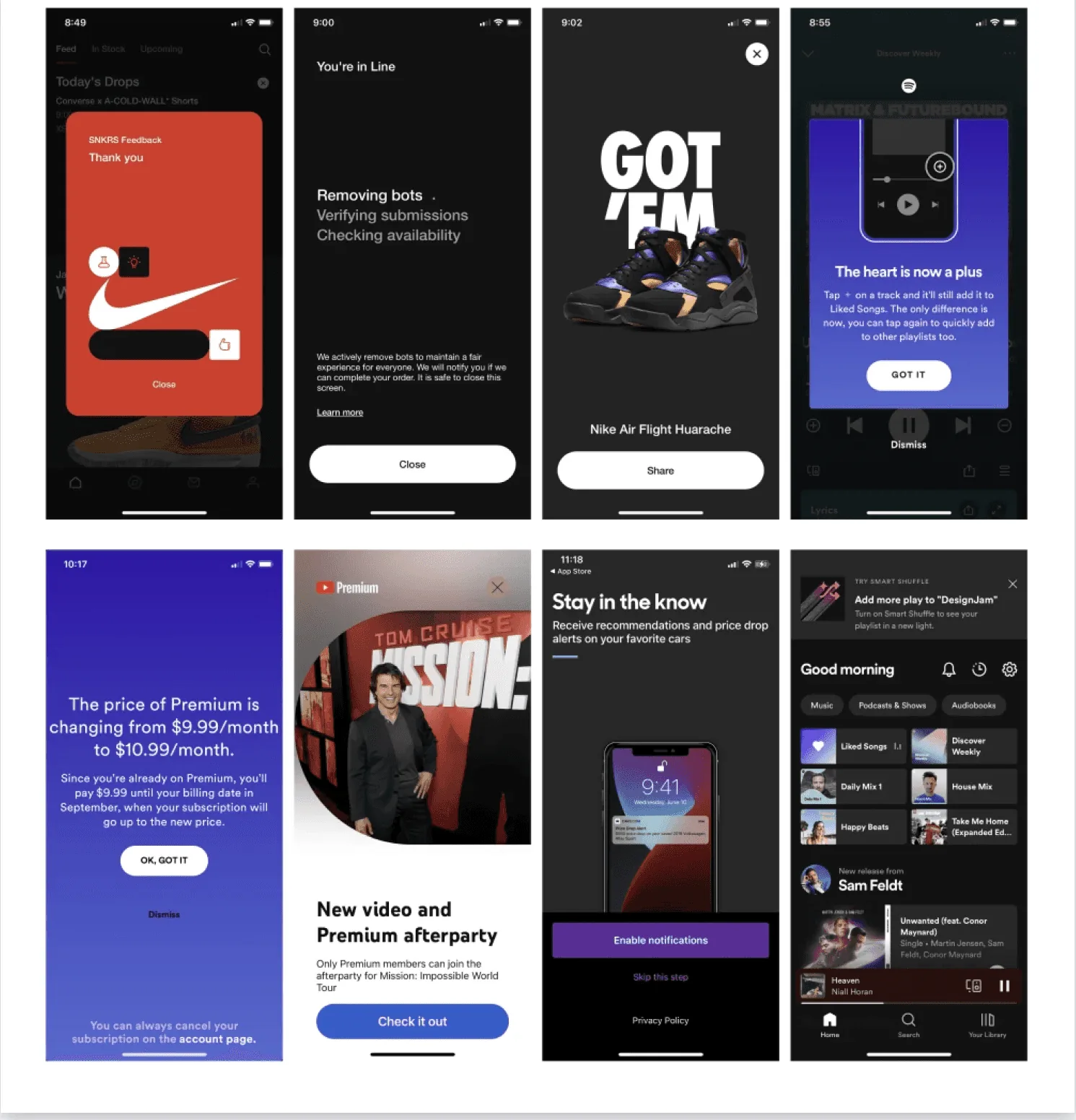
I also led a competitive analysis of major banks and looked outside banking, at Nike, Spotify, and other onboarding-first apps, to raise our bar beyond “table stakes.”

Design explorations
Two areas of focus, two design explorations
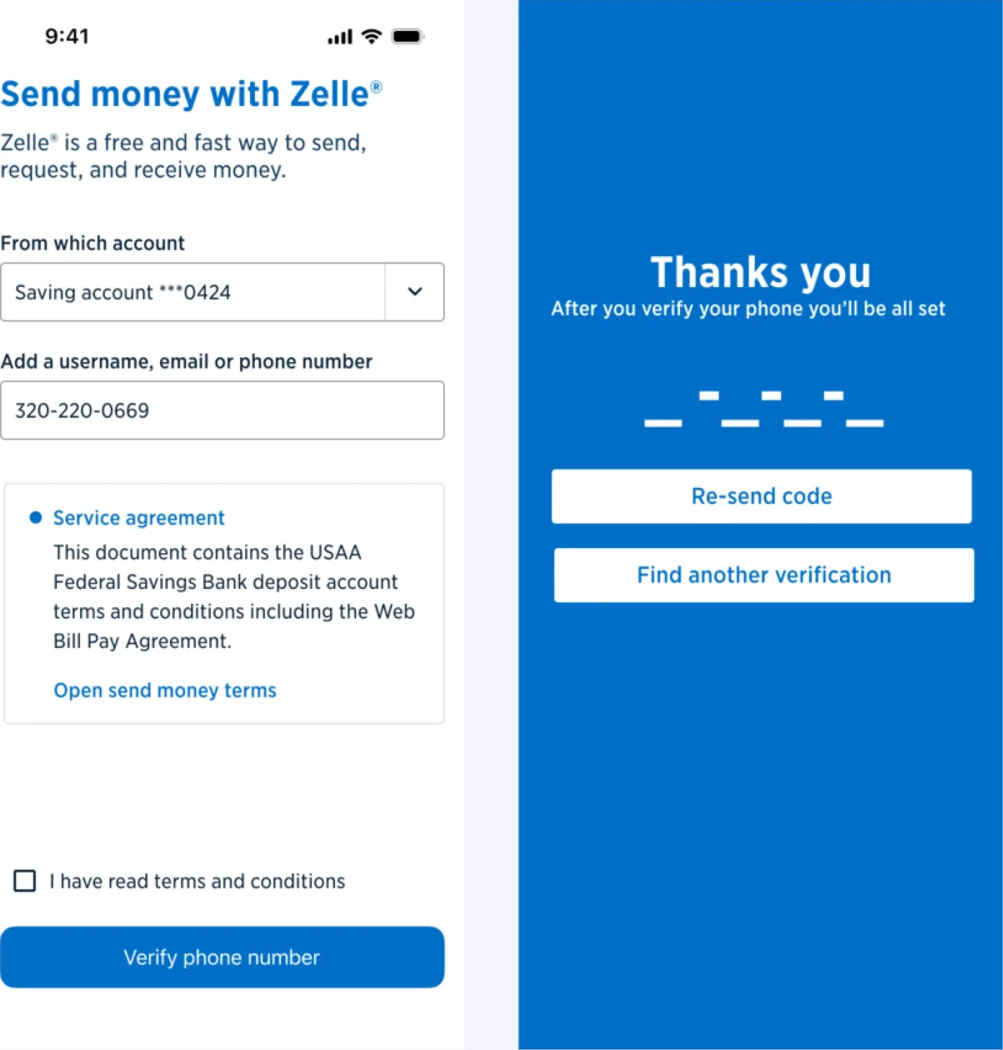
Intro and enrollment were the weakest links. Compliance work on QR codes and Zelle tags meant we had to touch enrollment anyway, so I pushed for a full rethink instead of adding steps to a broken foundation.

Two directions in parallel
Ambitious: a near one-click enrollment that showed the team what great looks like.
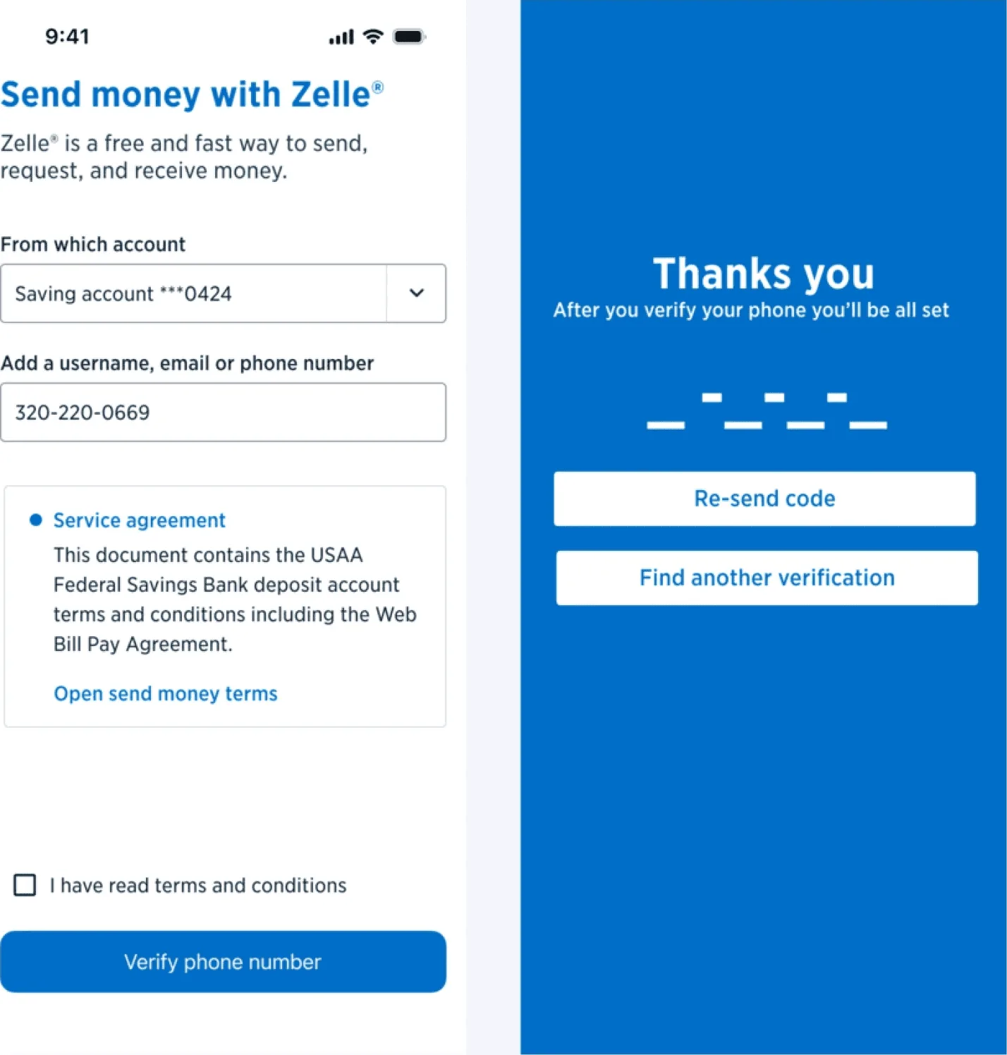
Pragmatic: a condensed hub-and-spoke flow that combined existing steps within today’s constraints.
Conservative and story-driven
Conservative: built from existing design system components. Low risk, easy handoff.
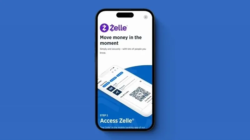
Story-driven: visually rich and made for hesitant or older members. It explains Zelle in plain language first.
Without showing the ceiling, it’s hard to justify pushing past the floor.
The ambitious concept raised our standard. Testing then refined the pragmatic path with that bar in mind.


Usability testing
Positive feedback, and one clear fix
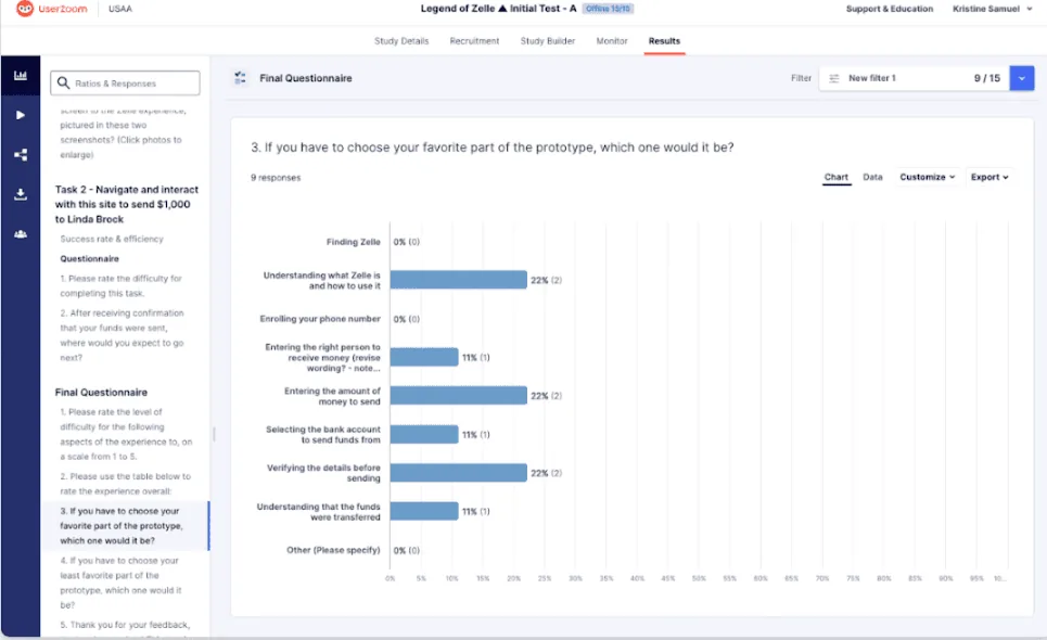
We ran remote usability tests. Each participant saw one intro concept at random, then went through the new enrollment flow. We measured task success, time on task, hesitation points, and confidence afterward.
What we wanted to learn
- Is there anything that blocks completion?
- Which intro creates more clarity and trust, not just visual preference?
- Where do people hesitate or skip important information?
What we found
- Every participant completed enrollment. The structure worked.
- The conservative intro was easier to use. The story-driven one was more engaging. That told us members wanted clarity more than immersion.
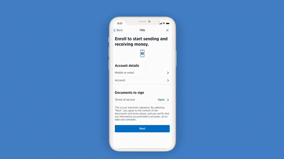
- Several people tapped the main button and skipped key fields, so the visual hierarchy needed work.
What we changed: we simplified the intro and sharpened the enrollment hierarchy.

Impact
Results in the first six months after launch
- Enrollment completion up 20% for members who entered the flow
- Zelle MSAT up about 20% for that same group
- Fewer “I thought I was already enrolled” complaints in early servicing feedback
- USAA back in compliance with Zelle network requirements
My role and what I learned
Going beyond the usual design role
Every team had a different priority. Risk wanted to avoid losses, Engineering was managing technical debt, and Product was watching the timeline. My job was to translate between them and keep the member visible in every conversation.
What this work required
- Aligning five teamsProduct, Risk, Operations, Engineering, and Design, all behind a vision each of them could see themselves in.
- Using data as a common languageMember complaints, drop-off rates, and MSAT trends moved us from “I think” to “the data says.” Trade-offs got easier once we put a number on the cost of doing nothing.
- Holding the vision through frictionReorgs, layoffs, and shifting regulatory timelines slowed us down. A team that kept asking “why do we do it this way?” kept “Zelle of Zelles” alive.
The highest-impact design work rarely starts with “how do we make this prettier?” It starts with the business risk, the member confusion, and the friction underneath.